Clyde Companies’ “We Value People” initiative is more than just a slogan—it’s a guiding principle that shapes the company’s culture, ensuring that employees feel supported, empowered, and valued at every level. Our task was to visually communicate this core philosophy through a compelling and cohesive design system that could be used across internal and external messaging.
Drawing inspiration from Clyde Companies’ commitment to growth, opportunity, and community, and together with their marketing team GRPHX developed a design that feels both strong and welcoming. The visual elements emphasize clarity, professionalism, and warmth, reinforcing the company’s dedication to fostering a workplace where employees can thrive. Wherever applied the design serves as a constant reminder that people are at the heart of everything Clyde Companies does.
Objectives:
- Develop a cohesive and engaging visual identity that aligns with the We Value People initiative.
- Create a welcoming and uplifting design system that emphasizes community, support, and professional growth.
- Ensure the branding is versatile and adaptable across internal communications, digital platforms, and print materials.
- Reinforce Clyde Companies’ commitment to fostering a culture where employees feel valued and respected.
Target Audience:
- Clyde Companies Employees – Serving as a reminder that they are at the heart of the company’s success.
- Leadership & HR Teams – Providing tools to communicate and promote the company’s people-first culture.
- Prospective Employees – Showcasing Clyde Companies as an employer that prioritizes its people and workplace culture.
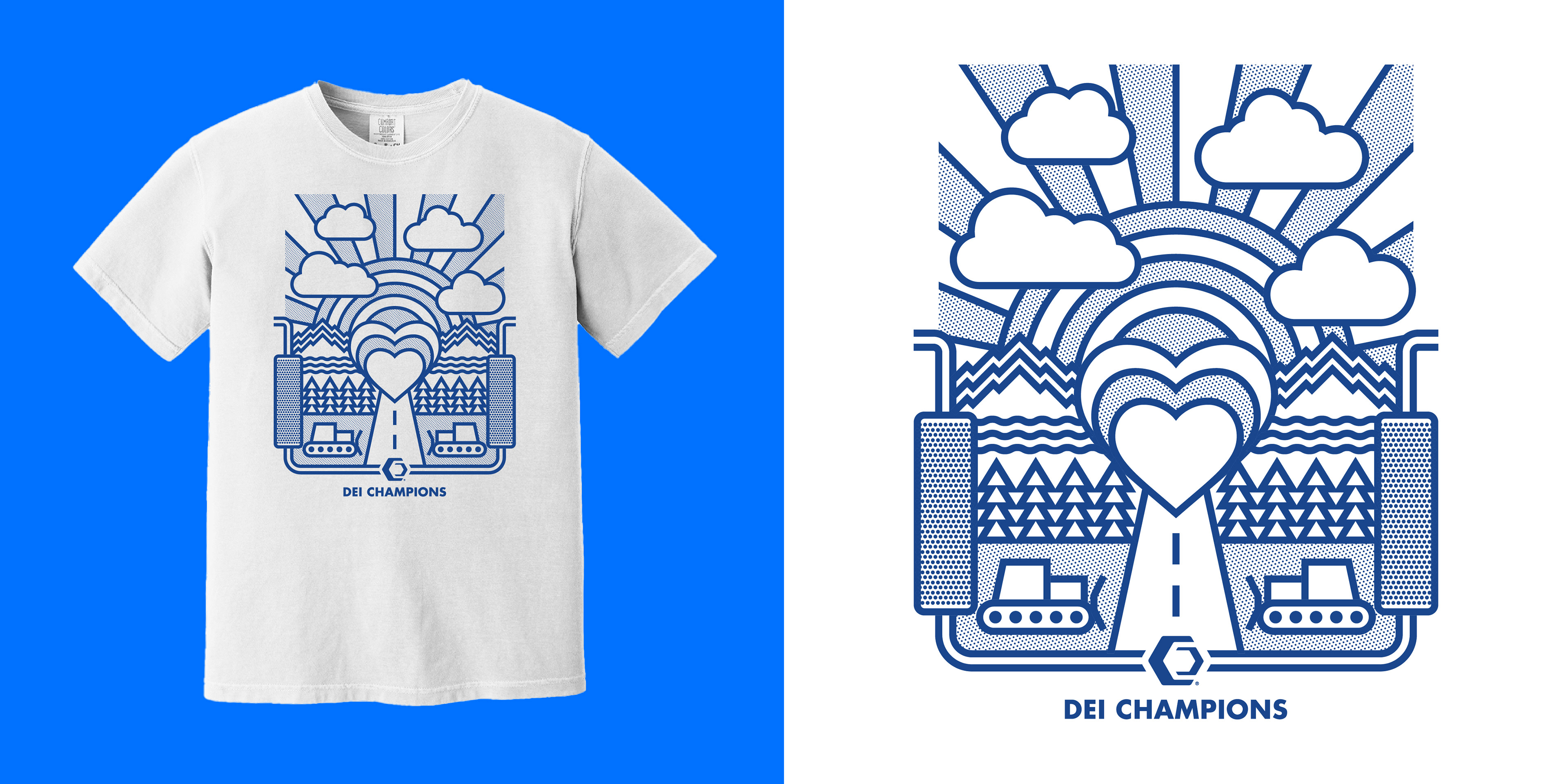
An early iteration of the design, before pivoting to more strongly reflect their core value of UNITY
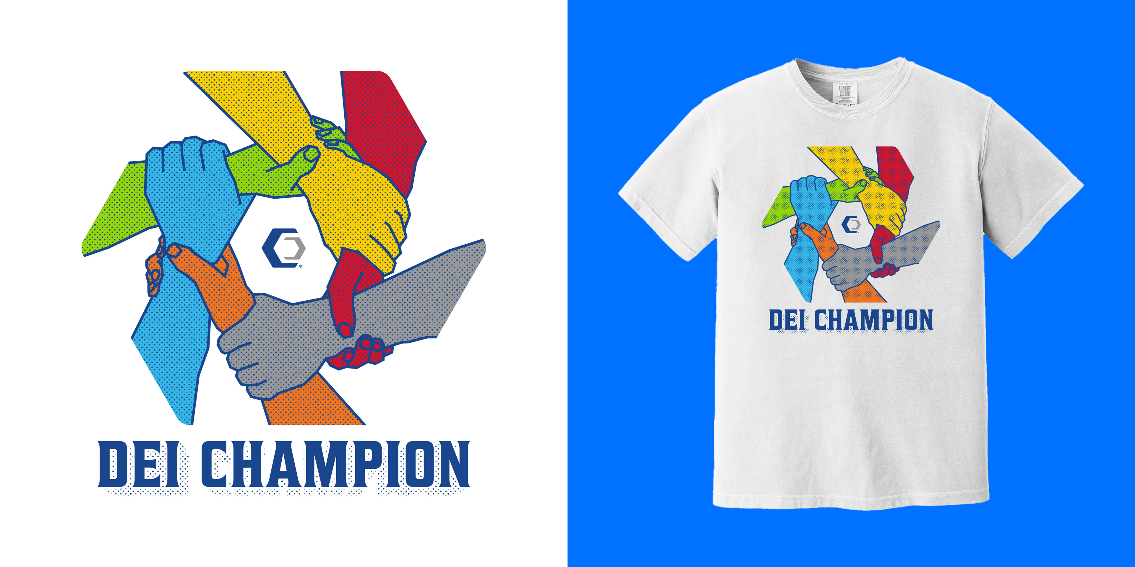
The colors represented Clyde Companies 6 main employers, Geneva Rock (Yellow), Sunroc (Red), Clyde Companies (Gray), Sunpro (Orange), Beehive Insurance (Blue), and BridgeSource (Green)
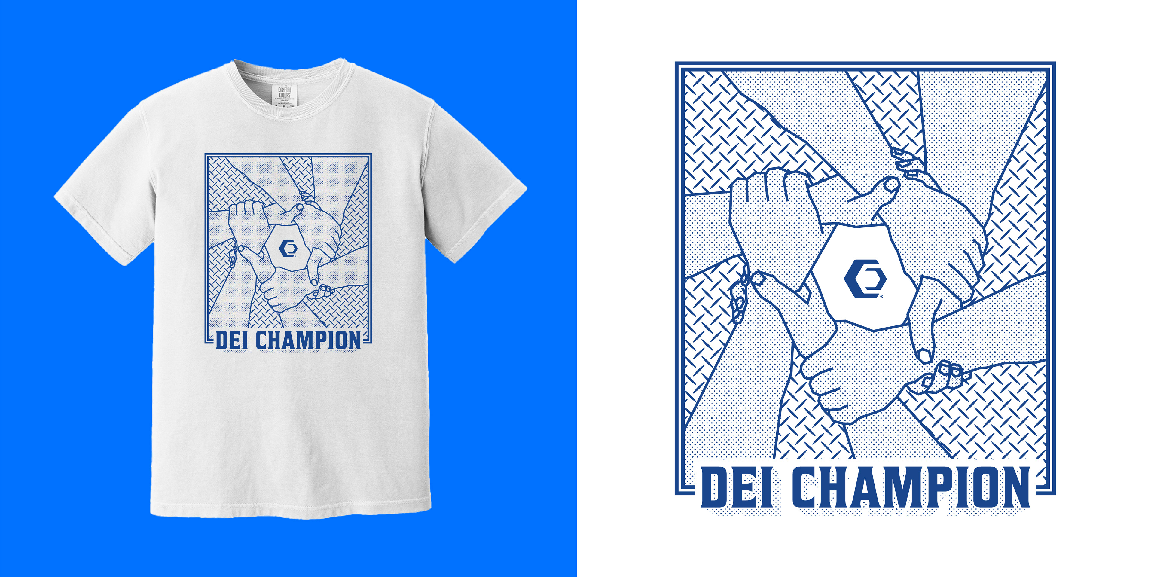
The final design, shortly after the. program was changed from "DEI Champion" to "We Value People"