Project Overview:
During the summer of 2020, while the world was in lockdown, the Dietz family approached GRPHX to create a logo and brand identity for their upcoming practice, Renegade Chiropractic. The name was inspired by Christ, whom they viewed as the ultimate renegade, challenging norms and teaching that character goes beyond merely following rules.
Objectives:
- Develop a bold and meaningful logo that aligns with the Renegade Chiropractic philosophy.
- Incorporate mountains to represent the practice’s location.
- Subtly include symbolism of Christ to reinforce the brand’s deeper message.
- Keep it soft and playful as they are a family chiropractic
Design Approach:
Through an extensive six-month design process, we explored numerous brand mark and logotype concepts, ensuring the final identity reflected strength, faith, and approachability. The final logo balances clean, modern aesthetics with a welcoming feel, embodying the family-focused and compassionate nature of Renegade Chiropractic.
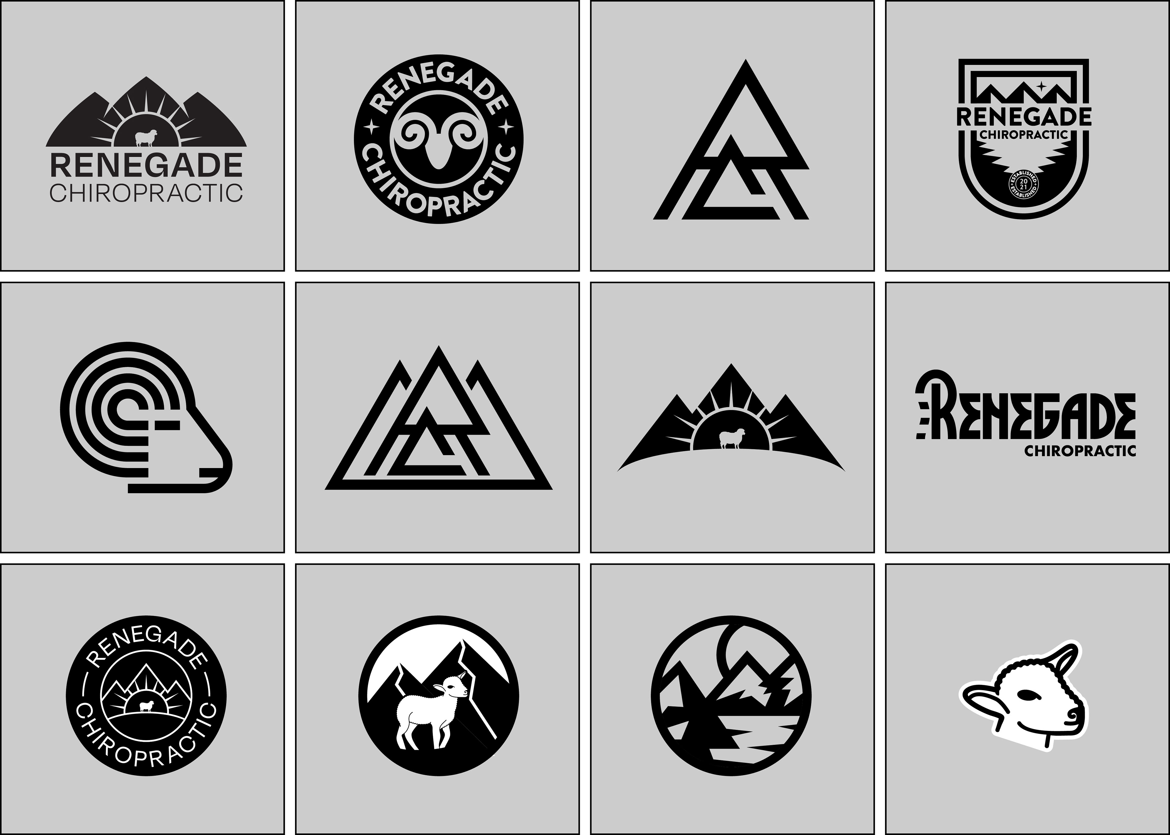
Selection of concepts presented along the design process
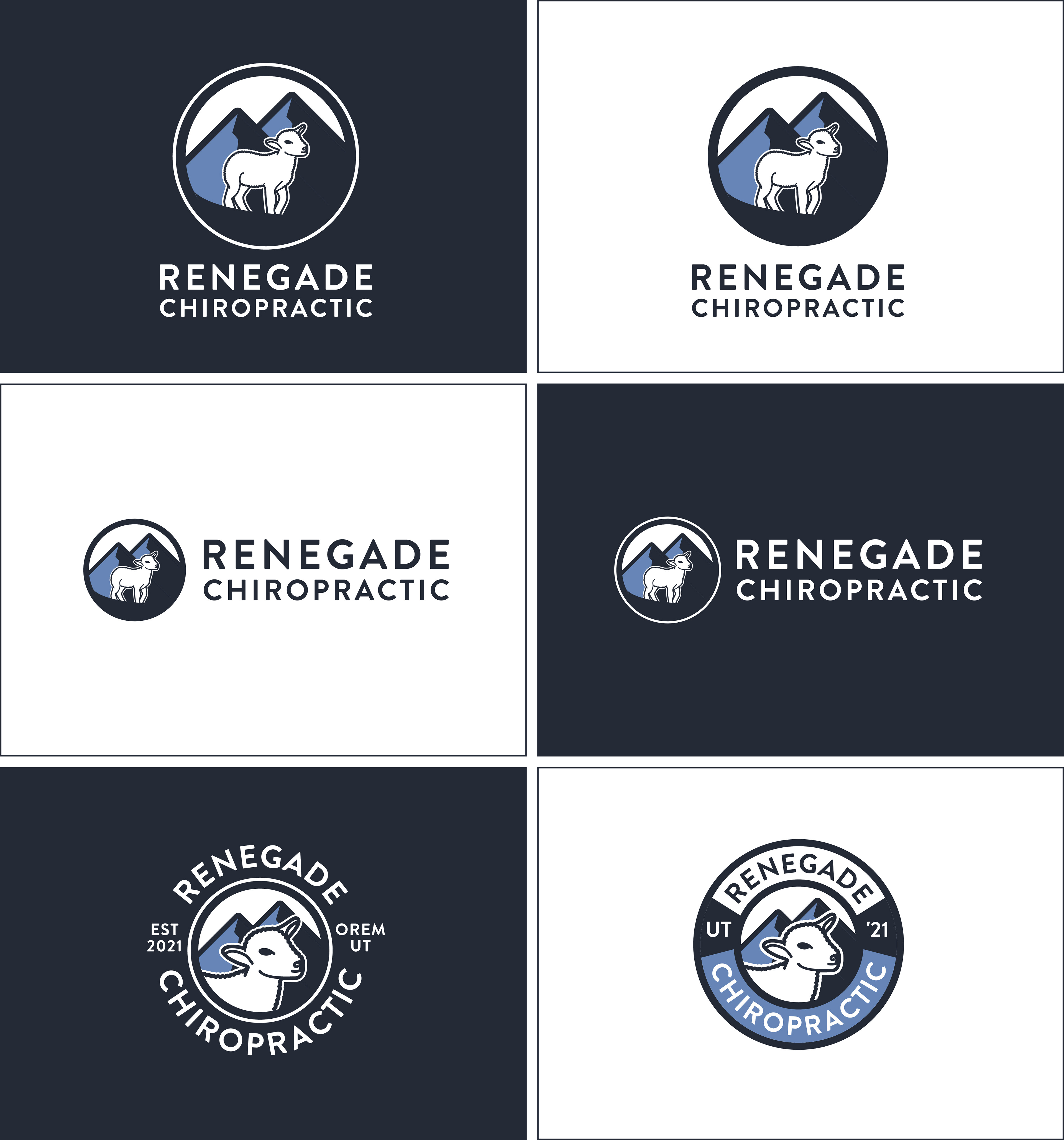
Finalized logos and alternate logos